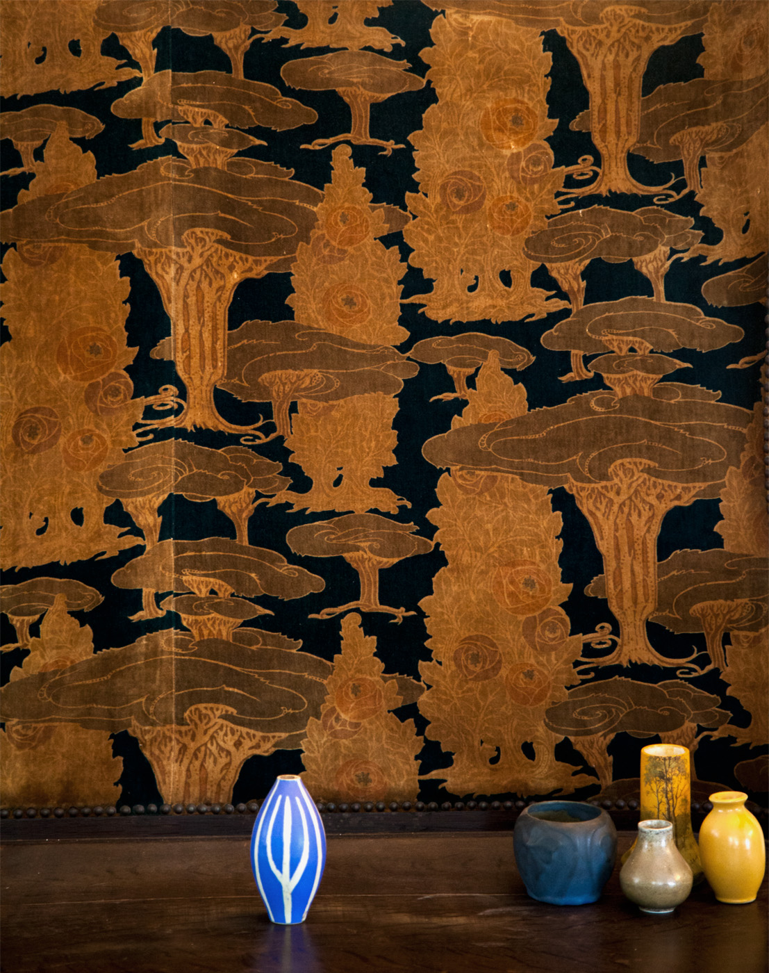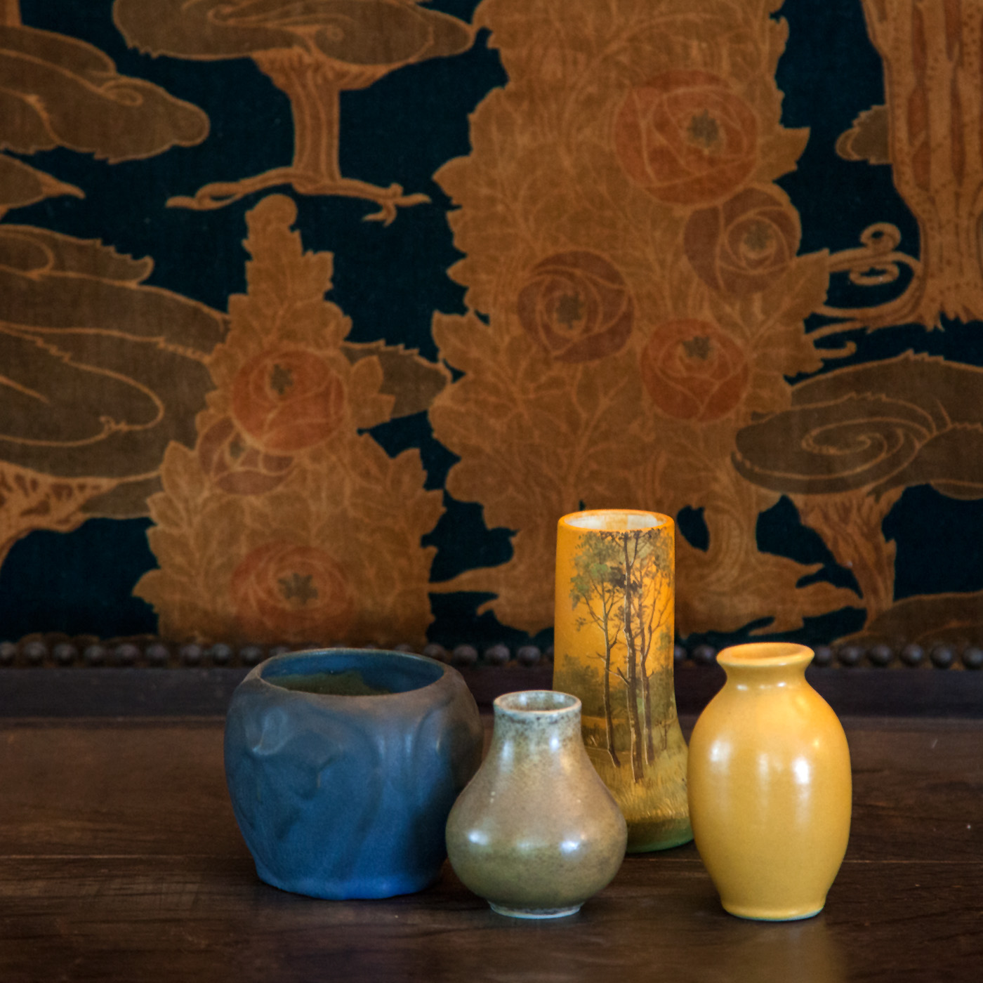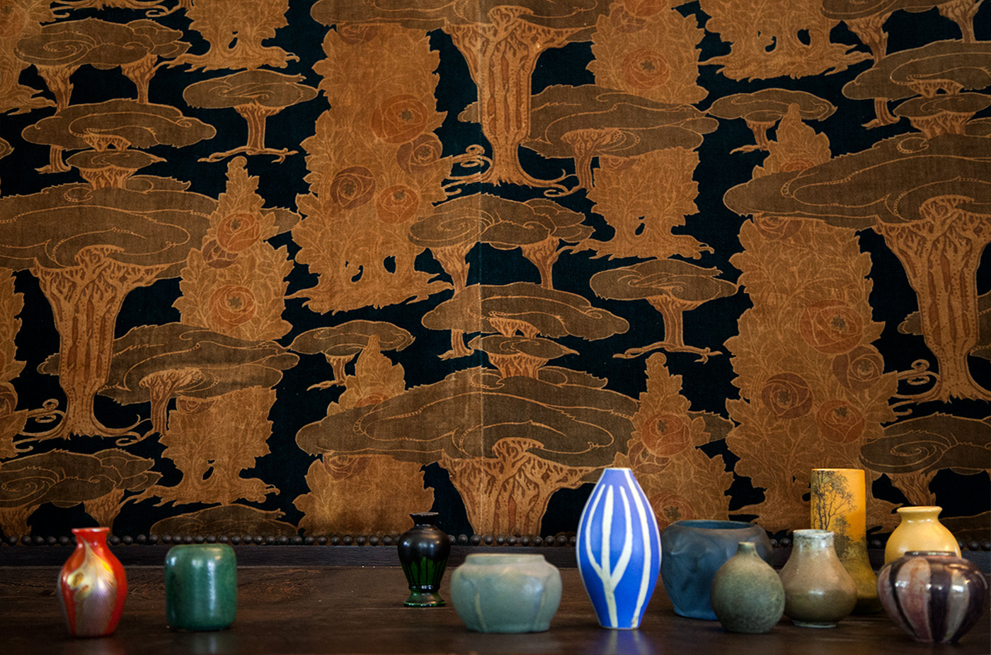

Building antique collections can start with a particular object category. For example, in this vignette above by David Smernoff of From Here To Antiquity, he placed a variety of miniature ceramic vessels clustered together to highlight their radiant color. If you speak with professional Visual Display artists and Window Display Artists, they will tell you that grouping similar objects can pack a strong punch – especially since these small ceramics are only about three inches tall. Here, all the ceramics are connected by their material, by a similar size and similar color saturation. It is okay that they are not all from the same era or of the same color. They compliment each other and tie together because they are of the same CATEGORY.
There are several other visual techniques being employed in the vignette that you might find useful when working with items from a similar category:

1. Try to visually explain the the key idea. In this vignette, the main idea to get across is that the pots are very SMALL. David was sure to crop the image in such a way as to dwarf the pots by showing the complete background. The vessels occupy only the bottom quarter of the entire picture while the background dominates appearing in all four quarters. A ratio of 1:4. This is similar to basic rules of photography where the horizon line is placed about 1/3 to 1/4 toward the bottom of the image. This allows the sky to feel vast and large.

2. Try to balance colors from across the color wheel. One way to create visual balance is to make the viewers eyes move across the image. To push the eyes, you can employ complimentary colors like green and red, across from the wheel and place them near each other in the composition. The vignette above uses a series of these compliments to move the eye starting with red-green on the left and moving to blue-orange on the right.

3. Create a rhythm using a constant color. By placing the green pots evenly across the composition it forces the eyes to want to connect them and count the green pots. One green pot is lonely. Two green pots are a pair and static, but three or more green pots creates a rhythm. Like counting, it does not seem like a sequence with any less than three similar elements like the green pots.

4. Create asymmetry. Symmetrical design is when the left side mirrors the right side. This form of layout is static. Think of it like the human body where the left side of the face matches the right side of the face. To make something more dynamic, to push the eye around the vignette, use dynamic asymmetry. You can do that with colors and rhythms that we mentioned above to achieve the method of balance.
Once you master the basics using 3 pots or so, try to create groupings within groupings. See if you can expand the basic ideas by using them on various groups and sub-groups. Soon you will have a extremely rich and complex layout.

